Screen Specs: Sizes & DPI app icon
Developer Tools · Utilities · Free

Screen Specs: the iPhone screen sizes app with 227 exact presets

Points, pixels, PPI, aspect ratio and safe-area insets for 95 Apple devices, offline.

  • Free · In-app purchases
  • iPhone · iOS 15+
  • 9 MB
  • Age 4+
  • Updated September 2026
  • English

Screenshots

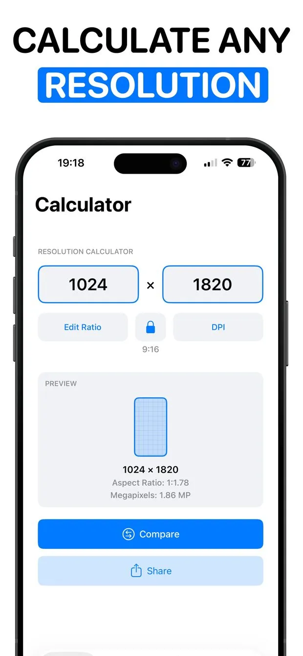
Screen Specs calculator with 1024 × 1820 entered, 9:16 ratio locked, and a preview showing aspect ratio 1:1.78 and 1.86 MP
Presets list with six categories: Device 95, Social 44, Video 11, Print 21, Ads 22, Android Flagship 34, and a search field
Comparison screen showing iPhone 17 at 1206 × 2622 beside iPhone 13 Mini at 1080 × 2340 with a pixel difference table
iPhone 17 detail page listing 1206 × 2622 px, aspect ratio 1:2.17, 3.16 MP, category, group and physical resolution
The resolution calculator in dark mode with the same 1024 × 1820 values entered and Compare and Share buttons

Screen Specs at a glance

Developer
Burak Köse, independent
Platform
iPhone · iOS 15 or later
Core use case
227 device, social, ad, print and video sizes with PPI and safe-area insets.
Key differentiator
227 exact sizes, all offline
Account
None needed
Internet
Works offline
Your data
Stays on your iPhone
Pricing
Free download · optional in-app purchases
Version
1.0.1 · September 2026 · 9 MB
Download
App Store

Screen Specs is a free, offline iPhone screen sizes app for designers and iOS developers. It lists 227 exact sizes: 95 device entries from the original iPhone to iPhone 17, 44 social placements, 22 ad and App Store screenshot specs, 21 print stocks at 300 DPI, 11 video standards and 34 Android flagship presets. Device entries show points, pixels, scale factor, pixel density, aspect ratio and safe-area insets.

227 exact sizes, all offline

95 device, 44 social, 22 ad and App Store, 21 print at 300 DPI, 11 video and 34 Android flagship presets. Every one is on the phone; nothing needs a network.

Safe-area insets, actually listed

Device entries show points, pixels, scale factor, pixel density, aspect ratio and top and bottom safe-area insets, the values most size charts leave out.

Ratio lock and DPI calculator

Lock an aspect ratio, change one side and the other follows. Enter any diagonal to get real pixel density. The preview shows ratio and megapixels as you type.

Compare, favorite, export

Put two resolutions side by side (Premium), keep favorites, add your own sizes, and export the whole catalog as JSON or CSV.

iPhone screen sizes and resolutions list, from the original iPhone to iPhone 17

The Device category holds 95 entries: every iPhone from the original to iPhone 17, plus iPad, Apple Watch, Mac and desktop displays. Open an iPhone model and you get its physical resolution in pixels, the logical size in points with the scale factor, pixel density, aspect ratio and the top and bottom safe-area insets. The iPhone 17 entry, for example, reads 1206 × 2622 px, an aspect ratio of 1:2.17 and 3.16 megapixels.

Android phones live in their own Android Flagship category with 34 presets, so they stay out of the Device list. Tap the favorite icon to keep a model in Favorites, or tap Apply to Calculator to carry its dimensions straight into the ratio and DPI tools.

  • Every iPhone, original through iPhone 17
  • iPad, Apple Watch, Mac and desktop displays
  • 34 Android flagship presets in a separate category
  • Search across all presets from one field

What are safe area insets on iPhone, and which iPhone screen sizes app lists them next to points and pixels?

The safe area is the part of the screen that stays clear of the notch or Dynamic Island at the top and the home indicator at the bottom. iOS reports it as insets, and if you lay out a screen without them, buttons end up under hardware. Most resolution charts publish width and height and stop there. Screen Specs lists the top and bottom safe-area insets for device entries next to the numbers that go with them.

Those companion numbers matter because iOS layouts are written in points, not pixels. A point maps to one, two or three physical pixels depending on the device's scale factor, so a 390-point-wide layout is 1170 pixels on a 3x screen. Device entries show points, pixels and the scale factor together, so you can move between the design file and the exported asset without a calculator or a browser tab.

How to calculate PPI from resolution and screen size with the built-in DPI calculator

Pixel density is the square root of width squared plus height squared, divided by the diagonal in inches. The Calculator tab does that for you: type a width and a height, tap DPI and enter the diagonal to get the real pixels per inch of any display. The same screen has an aspect-ratio lock. Tap Edit Ratio, choose a ratio such as 9:16, and when you change one side the other follows. A live preview under the fields shows the aspect ratio and megapixel count, so 1024 × 1820 reads as 1:1.78 and 1.86 MP the moment you enter it. Share sends the calculator result out of the app.

Compare, a Premium feature, puts two sizes side by side. Pick a preset for each slot, and a table lists width, height, total pixels, megapixels and aspect ratio for both, plus the difference in pixels and percent. Swap flips the two.

Where to find App Store screenshot sizes 2026, Instagram post size and A4 at 300 DPI in one offline list

Beyond devices, the catalog covers the sizes you look up when you export. The Ads category has 22 specs: the current App Store screenshot requirements plus the standard display ad units. Social holds 44 placements across Instagram, TikTok, YouTube, X, LinkedIn, Threads, Snapchat, Discord, Twitch, Reddit, WhatsApp, Facebook and Pinterest, so the placement dimensions sit in one list instead of thirteen help centers.

Print lists 21 stocks at 300 DPI: the ISO A and B series, US Letter through Tabloid and business cards, with A4 at 300 DPI ready as a preset. Video adds 11 standards from SD through 8K and DCI cinema. Every preset is searchable, can be saved as a favorite, and can be applied to the calculator or exported with the rest of the catalog as JSON or CSV.

  • 22 ad specs including current App Store screenshot sizes
  • 44 social placements across 13 platforms
  • 21 print stocks, all at 300 DPI
  • 11 video standards, SD to 8K and DCI

Is there a free offline screen size reference app for iPhone that does not track you?

Screen Specs stores the entire database on the phone. There is no account, no network request and no tracking, so a preset opens in two taps whether or not you have signal. The download is 9 MB and the app runs on iPhone with iOS 15.0 or later; it is offered in English and there is no iPad or Android build.

The full size database, search, the aspect-ratio and DPI calculator and JSON or CSV export are free. Premium unlocks side-by-side compare and removes the cap on custom sizes.
How it works

How to resize a design to a fixed aspect ratio with Screen Specs

  1. Open the Calculator tab

    Launch Screen Specs and open Calculator. Two fields hold the width and height in pixels.

  2. Lock the ratio

    Tap Edit Ratio and choose the ratio you need, for example 9:16. The lock icon shows the ratio is active.

  3. Change one side

    Type a new width or height. The other side updates on its own to keep the locked ratio.

  4. Read the preview

    The preview shows the resulting size, aspect ratio and megapixels. Tap Share to send it, or Compare (Premium) to check it against another size.

Made for

Who Screen Specs is for

Laying out an iOS screen

Look up points, scale factor and top and bottom safe-area insets for your target iPhone before opening Figma or Xcode.

App Store screenshots

Look up the current screenshot requirements in the Ads category, then apply one to the calculator for its ratio.

Exporting for social

Find the placement for Instagram, TikTok, YouTube, X, LinkedIn or Pinterest without opening a browser tab.

Sizing print at 300 DPI

Get the pixel dimensions for A4, US Letter, Tabloid or a business card at 300 DPI before sending a file to print.

Checking a spec offline

The whole catalog is on device, so a size is two taps away on a plane, in a basement or on a train.

Pricing

What is free and what Premium adds

Free No account

  • All 227 size presets across six categories
  • Search across every preset
  • Aspect ratio lock and DPI calculator
  • Favorites
  • Custom sizes, with a cap on the free tier
  • Export the whole catalog as JSON or CSV

Premium In-app purchase

  • Side-by-side compare of two resolutions with pixel counts and megapixels
  • Pixel and percentage difference between the two compared sizes
  • Unlimited custom sizes

Offered as an auto-renewing subscription or a one-time purchase where available. Prices are shown in the app and vary by region.

Information

Screen Specs: Sizes & DPI at a glance

Developer
Burak Köse
Category
Developer Tools, Utilities
Price
Free, with in-app purchases
Compatibility
iPhone · Requires iOS 15 or later
Size
9 MB
Languages
English
Age rating
4+
Version
1.0.1 · updated September 21, 2026
First released
September 13, 2026
App Store
Screen Specs: Sizes & DPI
Privacy policy
burakkose.me/privacy
Support
info.bk.apps@gmail.com
FAQ

Screen Specs — frequently asked questions

Does Screen Specs list safe area insets for iPhone models?

Yes. Device entries in Screen Specs show top and bottom safe-area insets next to points, pixels, scale factor, pixel density and aspect ratio. iPhone coverage runs from the original iPhone to iPhone 17; the Device category also holds iPad, Apple Watch, Mac and desktop displays, and the data is stored on the phone so it works offline.

Is Screen Specs a free PPI calculator app for iPhone?

Yes. The DPI calculator in Screen Specs is part of the free tier. Enter a width and height in pixels, tap DPI and type the diagonal in inches to get the real pixel density. The same screen includes an aspect-ratio lock and a preview that shows aspect ratio and megapixels for any resolution you type.

Does Screen Specs include the current App Store screenshot sizes?

Yes. The Ads category contains 22 specs: the current App Store screenshot requirements as of the app's September 2026 release, plus the standard display ad units. Any preset can be applied to the calculator, saved as a favorite, or exported with the rest of the catalog as JSON or CSV.

What Instagram post size and other social image sizes does Screen Specs include?

As of its September 2026 release, Screen Specs has 44 social placements across 13 platforms: Instagram, TikTok, YouTube, X, LinkedIn, Threads, Snapchat, Discord, Twitch, Reddit, WhatsApp, Facebook and Pinterest. Each placement is a preset with exact pixel dimensions and aspect ratio, searchable from one field and available without a network connection.

Does Screen Specs work offline, and does it track you?

Screen Specs works fully offline. The app has no account, makes no network requests and does no tracking; the entire 227-entry database ships inside the 9 MB download and stays on device. It requires an iPhone running iOS 15.0 or later and is available in English.

Can I export the screen size database from Screen Specs as CSV or JSON?

Yes. Screen Specs can export the whole catalog, all 227 presets across device, social, ads, print, video and Android flagship categories, as a JSON or CSV file. Export is included in the free tier, so you can pull the data into a spreadsheet, a design token file or a script without paying.

What is free in Screen Specs and what does Premium unlock?

The full 227-size database, search, the aspect-ratio and DPI calculator, favorites and JSON or CSV export are free. Premium unlocks two things: side-by-side compare, which puts two resolutions in one table with pixel counts, megapixels and the difference, and unlimited custom sizes instead of the free tier's cap.

Is there an iPad or Android version of Screen Specs?

No. Screen Specs is an iPhone-only app that requires iOS 15.0 or later, and it is offered in English. Its database does cover iPad, Apple Watch, Mac and desktop display sizes and includes 34 Android flagship presets, but the App Store lists it for iPhone only.